Surface Station Model Explained
The plots on wx.gmu.edu use similar station models, but not exactly the same.
Lab2: Analyze, draw and label isobars on the provided map at intervals of 4mb (hPa). If/where appropriate, analyse intermediate isobars using dashed lines at 2mb intervals. Also analyze fronts on this map.
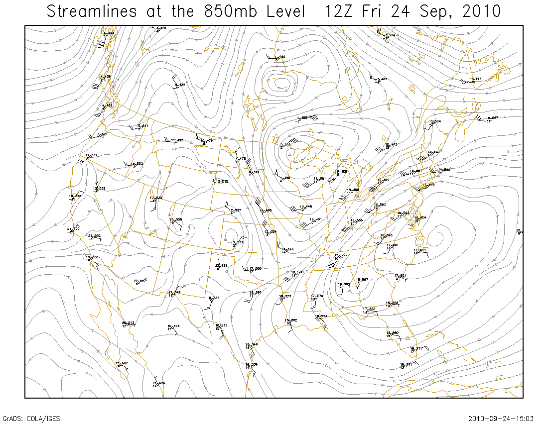
Streamlines: The lines are drawn to be tangent to the wind direction at the stations. Streamlines may begin and end wherever convenient. Generally, an attempt is made to make the streamlines evenly spaced. The lines are drawn with arrows to indicate the direction of the wind. The first slide of the lecture notes on winds shows an example of a streamline plot.
Another example of streamlines, as generated by a computer algorithm. The streamlines are drawn from the model analysis, and so are not going to match up with the observed data exactly. The model analysis also resolves data in what appear to be data-poor regions. When doing a subjective analysis, it is best to avoid trying to draw streamlines or other isolines in data poor regions.
Dewpoint Depression: The temperature minus the dewpoint. Never a negative value.
About the 850mb maps: The station models show the winds in knots, plotted as wind barbs. The temperature is the value to the "northwest" of the center of each station model plot, and the units are Celsius degrees. The dewpoint is the value to the "southwest" of the center, and it is also Celsius. The geopotential height is plotted as a three digit value to the "northeast" of the center of the station model, and the units are geopotential meters -- note that the leading 1 is left off.
One of the maps shows just the station models, and should be used for the analysis tasks. The "reference" map shows an analysis of temperature (isotherms), plotted as red dashed lines with a contour interval of 5 Celsius degrees. Also plotted is an analysis of heights (isoheights), shown as solid grey lines plotted with an interval of 30 geopotential meters. The isotherms and isoheights are plotted from the model analysis, and are thus not going to match up with the observed data exactly. The reference map is not required for performing the assigned analysis tasks, but it will be interesting for you to compare the wind and moisture analysis with the provided height and temperature analysis. The height analysis may also be useful to resolve wind flows in data sparse areas, by making use of the geostrophic wind relationship to height (pressure) gradients.
Lab4: On the provided 700mb Chart, analyse the short-wave troughs and ridges. A trough is indicated by a dashed red line, and a ridge is indicated by a zig-zag blue line. (Black lines are fine).
Locate a trough axis where heights are lower, at the point of maximum cyclonic curvature of the isoheight lines. Locate a ridge axis where heights are higher, at the point of maximum anti-cyclonic curvature of the isoheight lines.
A wind analysis can be helpful for locating troughs and ridges, since the troughs often align with the maximum cyclonic curvature of the streamlines, and the ridges often align with the maximum anti-cyclonic curvature of the streamlines. An analysis of the streamlines is available at this link.
If you refer to the Air Force Training Manual for weather analysis, you will find some explanation of troughs and ridges around page 39.